Saturday, May 28, 2011

Walk of Fame in May


Det er tid til at præsentere de kort vi har fundet til Walk of Fame. Som vi plejer, finder vi de mest fantastiske kreationer ude i blogverdenen og det er en stor ære at præsentere kortene vi har valgt til WoF.

Det er tid for å presentere kort vi har funnet til Walk of Fame. Som vanlig finner vi de mest fantastiske kreasjoner der ute i bloggverden og det er en stor ære å presentere kortene til 'WoF'

Det är tid att igen presentera våra val av kort till Walk of Fame. Vilken otroligt runda vi har haft. Vi hittade det mest otroligt vackra kort och vi har glädjen att visa kortena vi valt till 'WoF'.

It's time to present to you our choices of cards for Walk of Fame. We did have the most incredible journey looking for cards. It's a pleasure to show our choices for 'WoF'.

On aika kertoa mitkä kortit on tässä kuussa tullut valituksi Walk of Fame joukkoon. Mikä uskomaton blogikierros onkaan takana ja löysimme mitä uskomattomia kortteja. Meillä on kunnia esitellä teille tämän kuun valintamme 'WoF' sarjaan.

Walk of Fame
May 2011


Tinkstiina

Gratulerer * Congratulations* Onnea


Wednesday, May 25, 2011

Tutorial - Punches and dies


Det finnes så mange puncher og dies, og det finnes også uendelige måter å bruke og kombinere disse. Min tutorial i dag er et 3D rammekort, hvor jeg har brukt mange puncher og dies. Du kan selvfølgelig bruke tutorialen trinn for trinn, men jeg håper også du får inspirasjon til å lage dine egne varianter. Her er det bare fantasien som setter grenser.

*******


There are so many punches and dies, and so many different ways to use and combinate them. My tutorial today is a 3D frame card, where I have used a lot of punches and dies. You can of course use the tutorial step by step, but I also hope to give you inspiration to play and find your own variants.


Her er et bilde av hva jeg har brukt til kortet mitt. Du ternger slett ikke ha det samme utstyret. Poenget er å leke med det du har.

*******

Here you can see the tools I have used for my card. But of course you don`t need the exsact same things. The point is to play with what you have.


Jeg begynner med å kutte til to kartonger.
Den store er 5” / 6 3/4”, og passer til en ”around the page” punch.
Den andre kartongen kutter du litt mindre, alt ettersom hvilken bordpunch du har brukt.
Til å lage rammene har jeg brukt spellbinder dies i to forskjellige størrelser.

*******
I start with two pices of cardstock.
The big one is 5” / 6 3/4”, and fits an “around the page” punch.
The second cardstock is a little bit smaller, depending on wich border punch you have used.
To make the frames I have used two different sized Spellbinders.


Nå snur jeg den lille kartongen, og tegner en ramme rundt hullet.

*******


Now I turn the small cardstock, and draw a rectangle around the frame.


Jeg bruker bone folderen, og preger langs strekene.

*******


I use my bone folder to score the lines.


Snu kartongen, og se at du har fått en ekstra ramme.

*******


Turn the cardstock again, and you can see your scored frame.


Nå finner jeg mønsterpapiret jeg vil bruke, og kutter den til så den passer til den minste rammen.
Jeg sparer på den biten jeg har skjært bort, den vil også komme til nytte.

*******

I take the patterned paper I want to use, and cut it to fit the small frame.
Spare the left over, you will need it later.


Brett et dobbelt kort i den størrelsen du ønsker. Mitt brettede kort er litt mindre enn den store rammen.
Papirbiten jeg sparte på limer jeg midt på kortet, og mønsterpapiret jeg kuttet til har jeg her limt på den lille rammen.

*******

Now fold a card in the size you like. My folded card is just a little bit smaller than the big frame.
My left over paper I now fasten in the center of the card, and I also decorate the small frame with patterned paper.


Nå er det på tide å ta frem lim putene. Begge rammene har her fått 3D puter på baksiden.

*******


It is time to use some 3D pads.
Here both my frames have got 3D pads on the back.


Her har jeg montert rammene til kortet.
 Jeg starter med den minste rammen, og limer den store rammen på til slutt.

*******
Here you can see how I have mounted the card.
 I start with the small frame, and attach the big frame on top.


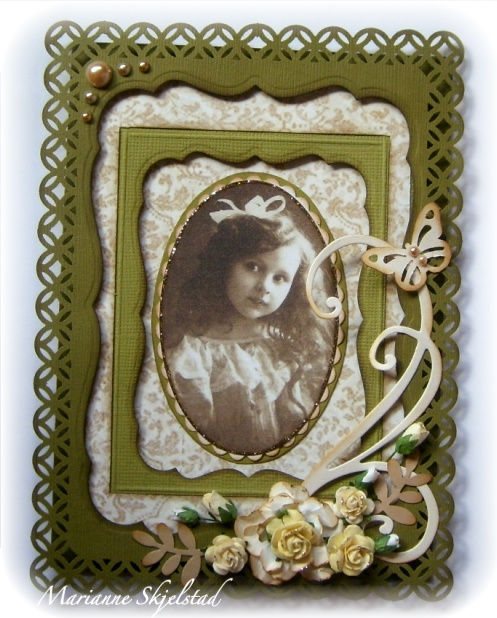
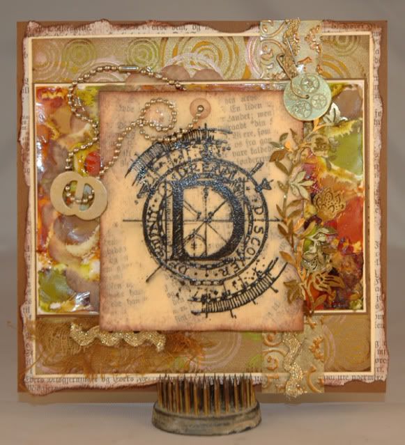
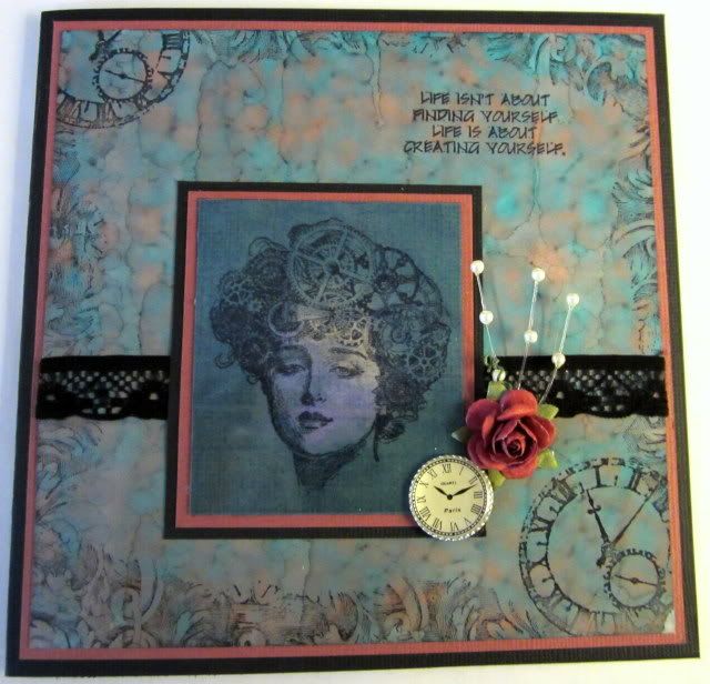
Her er kortet mitt ferdig. Jeg har brukt en oval Spellbinder til vintagebildet, og montert det på to Spellbinder rammer.
I tillegg til roser og noen perler har jeg dekorert kortet med en blomst laget av tre lag Spellbinder blomster, en sommerfugl fra Martha Stewart, swirle fra Magnolia og blader fra EK Success.

*******

My card is all done. I have used an oval Spellbinder for my vintage picture, and mounted it to two more Spellbinder ovals.
Beside roses and some pearls, I have decorated my card with a flower made by three Spellbinder dies, a butterfly from Martha Stewart, a swirl from Magnolia, and leaves from EK Success.


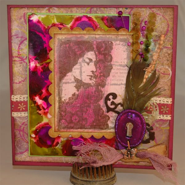
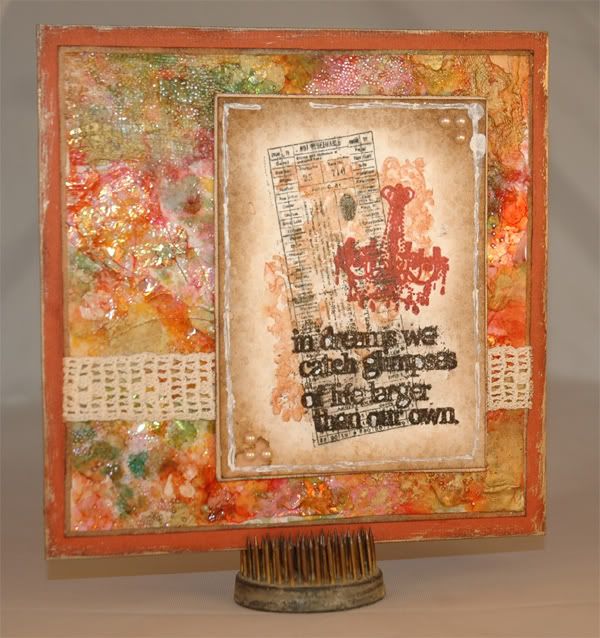
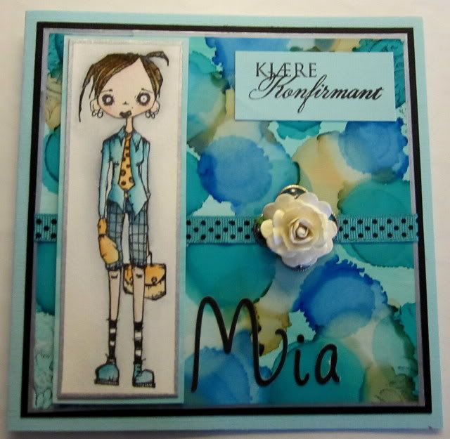
Her er et kort til, som er bygget opp på nøyaktig samme måte.

Se så forskjellige de blir.

*******

Here is another card built the exact same way.
See how different it looks.


Jeg håper du ble inspirert til å leke med puncher og dies.
Ha det gøy, og lykke til med ditt nye kort.

******

I hope you got inspired to play with punches and dies.
Have fun, and good luck with your card.

Thursday, May 19, 2011

Alcohol ink

På ARTsy temaet har vi jobbet med Alkohol blekk. Med Alkohol blekk kan du lage fargerike bakgrunner på glossy kartong. Mønsteret på bakgrunnen blir forskjellig alt etter hvilken måte du påfører alkohol blekket på. Mest kjent er kanskje Ranger sitt Alkholblekk - Adirondack, men det finnes i andre varianter som Pinata Color og Studio 2. Du kan også bruke Alkohol blekk på glass, plast og metall.

The ARTsy team have been working with Alcohol inks to create great colorful backgrounds. To create backgrounds you use Alcohol ink on glossy cardstock. The "pattern" on your background become different every single time depending on how you apply the alcohol ink. Ranger are maybe the more well known company making Adirondack Alcohol inks, but there are other brands like Pinata Color and Studio 2. Alcohol inks can also be used on glass, plastic and metal.


Silje's cards


Inger's cards


Yvonne's cards


Vi håper du ble inspirert til å bruke Alkohol blekk på dine kreative prosjekter! Legg gjerne igjen en link til noe du har laget eller en liten hilsen. Det setter vi stor pris på!

We hope you did get some inspiration to try out Alcohol inks on your creative projects! Please feel free to leave a link to your project or leave a comment!


Monday, May 16, 2011

~Readers gallery~


Welcome to reader gallery
where we showcase some great
Reader contributions.

We find that more and more follow our tutorials
and we are very happy when you link back to our blog.

What we are EVEN more happy is when you send us an email
where you show us what you have created!
Then we can, together with you, show the world how inspirational YOU are!

THANK YOU for sending us mail..


************************************************************


Gerdie has made a beautiful tag-in- box - card and


Anita has made a really magic card


 and made this card:


Remember to e-mail us or leave a comment,
 if you have been inspired
by any of our articles.

We are looking forward to show of your
project in our magazine


Sunday, May 15, 2011

An introduction to calligraphy- Part 2

Del 2 - Humanistkursiv -Hur gör man?  
Part 2- Cancellaresca - How to do it?
Hej igen!  Hello again!


Idag  tänkte jag alltså att vi skulle titta på grunderna till en av kalligrafistilarna jag visade igår, nämligen Humanistkursiven- Cancellarescan !


Today we´ll have a look at the basics of one of the calligraphic styles I showed you yesterday- the Cancellaresca!


Det viktigaste att tänka på när man skriver med bredpennan är pennvinkeln.
Den vanligaste pennvinkeln som används till (nästan) alla stilar är 40-45 grader, och den ska man försöka hålla konstant hela tiden när man skriver.

The most important thing to keep in mind when using the broad pen is the pen angle. The most common pen angle, used to (almost) every style, is 40-45 degrees, and you should try to keep it constant at all times when you write.


Sen är det viktigt att välja rätt bredd på pennan utifrån hur stor text man vill ha . Alla olika stilar har ett eget idealt förhållande mellan pennbredd och bokstavsstorlek, den sk x-höjden. Det är storleken på ett  litet x (och alla andra stapelfria minuskler-små bokstäver) räknat i antalet penbredder. När man mäter x-höjden ska pennan hållas i rät vinkel mot linjerna:

Then, it is important to choose the right width of the pen based on how large text you want. All styles have their own ideal relationship between the pen width and height of the letters,  the so-called ”x-height”. That is the size of a small x (and all other staple free lower case letters) in terms of numbers of pen widths. When you measure the x-height you should hold the pen in a 90 degree angle:


För humanistkursiven är x-höjden vanligen 5(-6) pennbredder och stapelhöjden 3(-4) pennbredder.

 For cancellaresca, the x-height is usually 5 (-6) nib widths, and the height of the staples 3(-4) nib widths.

 När man ska  börja skriva är det till stor hjälp att rita upp stödlinjer. Mät  x-höjden för just din penna och rita linjer:

When you´re starting to learn , it´s very helpful to draw lines  for support. Measure the x-height for your special pen and draw the lines :


Så småningom räcker det kanske med baslinjen, åtminstone när man ska öva.

In a while it might be enough with the base line, at least for practicing purposes.


Kursiv betyder ju lutande och humanistkursiven är i allmänhet lätt lutande.  Bokstäverna är förhållandevis smala och höga. När man formar bokstäverna tänker man sig att de ska rymmas i en lutande rektangel, en romboid:


Cancellaresca is generally slightly ”tilted”. When you shape the letters its helpful to imagine that they should fit into a tilted rectangle, a rhomboid:


Några få olika former är grunden för de flesta bokstäverna:

A few different forms is the foundation of most letters:


Se på bokstaven "a". Både bilden ovan och nedan visar i vilken ordning bokstavens delar skrivs. Kom ihåg att pennan med fördel förs "medhårs", alltså uppifrån vänster  nedåt höger. Grundtipset  är alltså att  alltid börja med den del av bokstaven som är längst uppe till vänster.
Se också nedan hur många av bokstäverna har exakt samma bokstavskropp- Det lönar sig alltså att nöta in dessa grundformer ordentligt!

Look at the letter "a". Both the picture above and below shows in which order the parts of the letter are written. Remember to usually move the pen the "right way", thats from above/left  downwards to the right. That´s the general tip for all the letters, start in the top left corner.
Below you can also see that many of the letters have the exact same "body", so it´s really worthwile
to practice these shapes properly!


I allmänhet  skriver vi alltså medhårs, MEN i just humanistkursiven gör man  faktiskt lite ”mothårsstreck”  hela tiden  i dessa moment:


As I said, generally we write "the right way" BUT in this particular style we do make some lines "the wrong way", in these particular moments.


Hela alfabetet:


The whole alphabeth:


Ser formerna bekanta ut?  Den handstilsreform som genomfördes i svenska grundskolan på 70-talet hade just humanistkursiven som utgångspunkt, så vi som gick i skolan och lärde oss skriva på 70-talet har ju egentligen redan grunderna till denna stil!


Do the shapes look familiar ? The handwriting reform that  took place in the Swedish school in the 70's had  the cancellaresca e as a starting point, so those of us who went to school and learned how to write in the 70 's are  already familiar with the basics of this style !

För att en text ska se vacker och harmonisk ut krävs inte bara vackra bokstäver. Helhetsintrycket avgörs minst lika mycket av att man försöker hålla en konstant pennvinkel, en jämn lutning på bokstäverna och lagom mycket luft mellan bokstäverna och mellan orden.  Som en tumregel ska man ha ungefär lika mycket luft mellan bokstäverna som inuti dem- lita på ditt öga vad som ser snyggt ut.  Mellan  orden ska man kunna få plats med ett ”r”. Det är också viktigt att hålla ett tillräckligt avstånd mellan raderna för att upp- och nedstaplarna inte ska krocka.


For a text to look nice and harmonic, it requires not only beautiful letters. The overall impression is just as much dependant  on the maintaining of a constant pen angle, a constant gradient of the letters and just enough space between letters and between words. As a rule of thumb you should have about as much space between the letters as inside them.
Trust your eye on what looks good. Between the words you should be able to fit one "r". It is also important to keep an adequate distance between the lines to  avoid that up- and downgoing staples  collide. 

Ett exempel på textmassa skriven i syfte att öva just detta:

An example of text written just to practice this:


De små böjarna på bokstävernas staplar kallas serifer och kan se ut på olika sätt. Den enklaste och vanligaste utgörs av en bara av en lite böj ( se övre raden)
En annan vanlig variant som förekommer på bokstävernas högstaplar är dessa ”flagg”serifer  (se undre raden):


The small bends in the letters columns are called serifs and can be designed in various ways. The most common and simple is  just a little bow (upper row).
Another common variant found on the letters upgoing staples are the "flag" serifs (lower row):


Man kan sen också fundera lite över skriftens layout-  Rak vänstermarginal eller centrerad text är vanligast och ofta snyggaste, tycker jag.
Men man kan ju också  välja att placera ut texten lite "på känsla" :). Det kan ju då vara bra att ha provskrivit några gånger på kladdpapper först... Man kan också klippa ut sina textremsor och placera ut dem som man tycker passar innan man skriver på sitt riktiga projekt :).


Then, you can also give some thought to the layout of the scriptureStraight left margin or centered text is most common and often most beautiful, I think.
But you can also choose to place the text rows a bit "by feeling"  :). It could then be useful to have testwritten a few times on scrap paper first ... You can also cut the text pieces out, and place them as you see fit before  writing on the real project:).


Detta är ett av de allra första korten jag gjorde i  min kortmakarkarriär :).
Resten av kortet är inte så välarbetat men textplaceringen krävde en del eftertanke...Om det sen blev bra eller inte får ögat avgöra- här finns inga rätt eller fel :)...


This is one of the very first cards I made in my cardmaking career :). 
The rest of the card is not so well-made, but the placement of the text needed some reflection.. Whether the result was good or not is up to the eye decide, there is no right or wrong :)....


Nu är det bara att skriva och skriva – övning ger färdighet!
När man tycker att man fått kläm på grunden kan man ju pröva lite varianter, tex
      smalare  och vassare bokstäver
      olika lutningar
      binda ihop bokstäver
      slingor som dekoration
… eller annat kul man kan komma på!


Now, just keep on writing - practice makes perfect!
When you think you´ve figured the basics out ,  you can try some variations, such as
- narrow and sharp letters
- different gradients 
- tie the letters together
- loops for decoration
... or other fun things you can think of!


LYCKA TILL med skrivandet!  GOOD LUCK with your writing!


Eva